Sunday, June 2, 2013

It's Munny, Baby! (for Charity, that is)

This piece is not exactly a gravity painting, but I thought I'd share it on this site, as
1) It is for charity
-and-
2) Some of my gravity painting techniques are used in this piece.

A couple of weeks ago, I got an email at work from one of my coworkers.  He was casting a wide net in the artist pool, to see if anyone wanted to paint something that would be sold for charity.  It turned out that our good friends at PopCap Games wants to highlight their upcoming game sequel to Plants vs Zombies, and is going to be having a booth at San Diego Comicon

At their booth, they are going to showcase Mega Munnys that have been painted in the style of
Plants vs Zombies Characters.  I decided to make mine based off of the Hypno-Shroom:

For those not in the know, when a zombie eats this, they turn around, and start eating other zombies!  As it was one of the more colorful characters, I thought it would work best with my style.

After being displayed at their booth, they are going to auction them off, with the proceeds going to Child's Play charity.  It's a great cause & I encourage you to donate to it as well!

Here's what I came up with:
One pill makes you bigger...
Here's some detail shots:
This texture makes the color change depending on which angle you view it


I see this & think of the voices of the green aliens in Toy Story:  "Oooooh!"

My wife's idea:  change the tail to a ladybug.

Dude has an arm tat.  My hidden signature.


Oh Hai! You can email me now!

Soooo...  On the 24th, my work was kind enough to link to my site, and I didn't have any way for anyone to contact me.  I'm very sorry, my bad! 

I've since set up a contact form on the lower right hand side of the blog ---->

If you are interested in a custom piece and donating to a charity, you can contact me via this form!

Cheers,
T


Tuesday, March 12, 2013

Gravity Painting and Charity Causes

I've decided that for the next five years, all proceeds of the sale of my Gravity Paintings will go to charity.  I'm very fortunate to have a wonderful full time job that is not only satisfying, but also pays the bills.  And, that is saying a LOT in this economy!  This is a small way for me to give back to my community.

Because I have a full time job, it means I'm not able to make as many paintings as a full time artist.  So, these are quite rare.  My first priority is to fulfill commission painting agreements that have sold at charity auction.  I donate all material and labor costs for these pieces.

If I have extra time, I take on non-auctioned commissions in a way that maximizes the amount of money that goes to charity, while covering my material costs. My time is still donated.  Gravity #5 came to $300 in material costs alone.  I used some very, very high quality paint and support material for it.  After consulting with my accountant, here's what we came up with:

The buyer and I determine what type of piece I'll be creating.  Usually, we talk about size, support, colors, and intention for the piece.  Then, we determine the final cost of the painting, and the charity we'll be supporting.  When the buyer takes delivery of the piece, I receive two payments.  One is for material costs, and the other is made out to the charity.

I also encourage all donors who have a piece from this exploration to consider this personal request:  If you ever resell any of the paintings from this exploration, it is my wish that 10% of the sale price be donated to charity.  I've written that on the back of some of them.  This isn't legally binding, but wouldn't it be great if every time it passed from one collector to another, a little was given to charity?

Speaking of which, I wanted to point out which pieces have already sold for charity:

GRAVITY #TBA
I sold a commission painting agreement last weekend at Make a Wish's Annual Gala silent auction!  As I was hovering around my paintings in the final minutes, I was able to meet and speak briefly to the couple who bought it.  And, I couldn't be happier to know for who my next piece will be made!  Thank you again for donating to this cause!  I'm looking forward to hearing from you in the near future! 

GRAVITY #9
I also sold #9 at the Gala.  Thank you VERY much to the donor at that event!  It was really great meeting you there too!  I hope you enjoy it for many years to come.  Below is a picture of it as a work in progress. 


GRAVITY #10
This piece sold at last year's Daylight Lodge 232's "Aces for Charity Casino Night" silent charity auction.  Work in progress links are here and here.

GRAVITY #5
This piece is the largest I've done to date.  This was before I started molding the support to enable the painting to change depending on the angle you look at it.  I'm so glad I found someone who values it as much as I do!


Thanks again to the donors/collectors who believe in my work and believe in good causes!  You are wonderful people!

Tuesday, October 9, 2012

Gravity Painting #10, Final

Going to add more comments later, just wanted to get these shots up tonight.  Click to enlarge.


So, the interesting thing about this painting technique is that the piece looks different from different angles.  For a better understanding of how I did this, please read the previous two entries.  Entry 1  and Entry 2.

Long story short(er):  I made thick textures on the board with pumice gel and then sculpted it with a serrated clay tool, to make gouges and ridges in the gel.  I then painted the entire piece.  When it was dry, I then used an airbrush aimed not at the piece, but parallel to it!  The paint only landed on one side of each ridge, in the rainbow design seen above.  The detail shots below make this more apparent.

Ridges are easier to see, as the copper & golden paint filled the gouges a bit.

Reminds me of a butterfly wing close up.  Some dry brush work in black here.

Another detail of the ridges.

My daughter says that this part reminds her of crows flying in formation in the sky.

The three images above are from the same part of the piece, taken at different angles.  Worth clicking on for an enlarged view
Eye of Horus

Jupiter Cloud Pattern

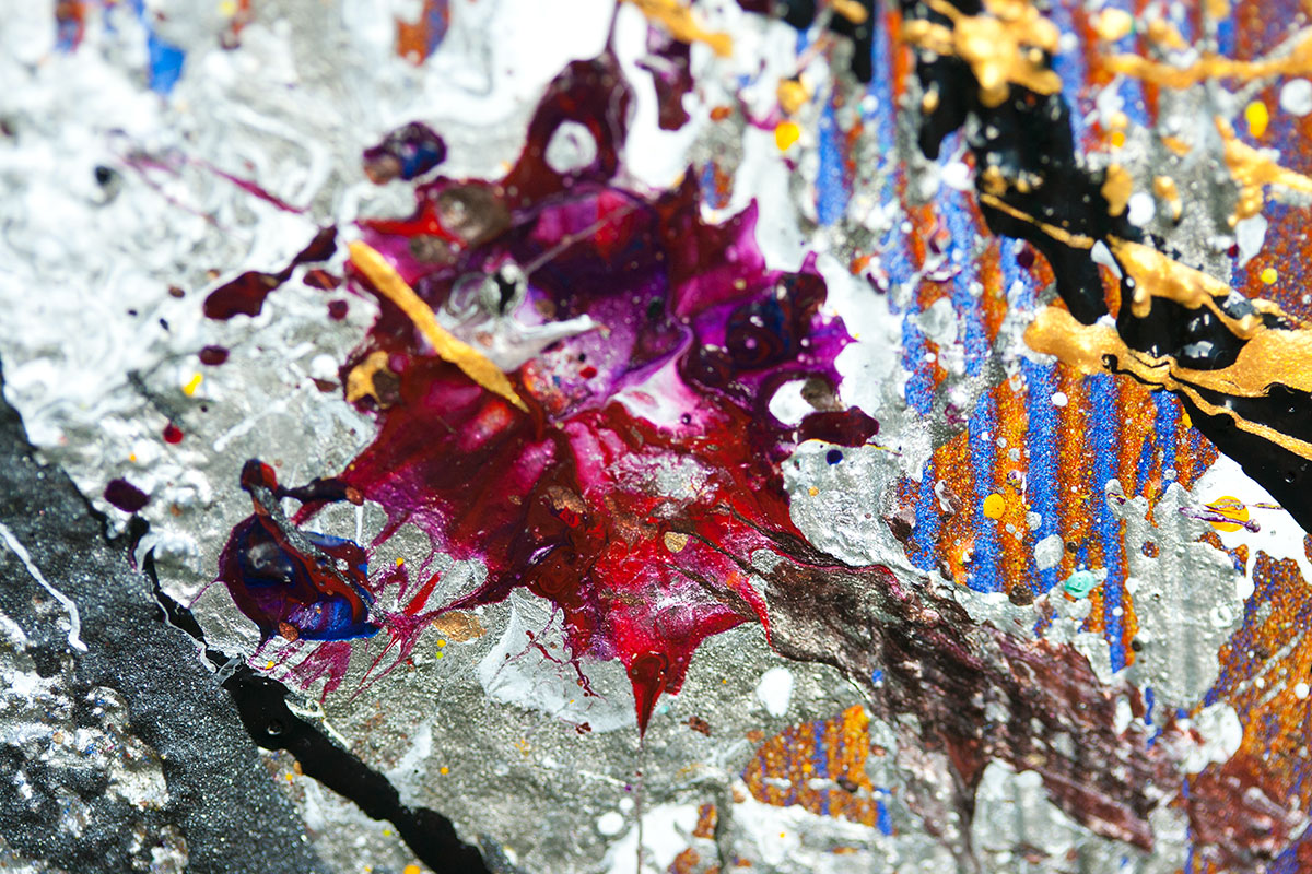
No metaphor here.  Just a wonderful purple splat!

Second shot with a tennis ball; the first shots had more of a splat.

1980's comic book color scheme.  Or ketchup & mustard.

Enlarge for details of the teal & white swirls

All of these remind me of fantastic space imagery.

Classic colors and reflective pattern of amusement park ride paint schemes.


Finally, a cheesy animated gif, so you can see how the imagery changes depending on your angle.


Monday, September 3, 2012

Gravity #10 Work In Progress Part 2

Yesterday, I laid down the second coat on Gravity #10.  Except for one mistake, I only sprayed it from one direction.  This make is so that it looks different from different angles.  Confused?  Pictures are worth a thousand words.  Take a look below.


This is the angle in which I sprayed the paint.  I know where this painting is going to hang in the person's house who it is being made for.  When people exit the dining room & head into the living room, it will look like this (plus all of the splatter lines).  You can see part of Gravity Painting #9 in this shot, along with Lori Chandler-Lewis's "Pointy Garden"


This is the same painting from the other angle.  When they go from the living room into the dining room, this is what they'll see.


If the painting is looked at head on, this is what it will look like.  Mostly.  I had a huge challenge photographing this painting, because I only have two flood lights.  Normally when one photographs flat art, one can simply place the floods to either side of the image, and there is little or no glare.  Not so with this image.  Because the canvas has been altered by adding sculpted lines, any no diffuse lighting results in glare.  I ended up lighting it from a bunch of different angles & blending the angles together in Photoshop to get the most accurate image possible.


For those wondering what size this is, a little bit of background has been added for comparison.  Harry Potter (American & British) and other books in the background.

Gravity #8... Finally

Here ya go.  I wasn't as happy with this one as some of the other work I've done.  The smooth texture of the airbrushed background didn't integrate as well with the line art on the foreground.  Some may find this more pleasing.  Hey, the artist can't always be right :)   I think it was a worthy experiment, and it provided a lot of feedback for gravity #10.  Namely, the texture work I did when laying down the gesso was not dramatic enough to get the effect I was looking for.  Gravity Painting #9 proved to be more successful in that regard.


Wednesday, August 29, 2012

Gravity #10, Work In Progress

I have a very patient friend who is awaiting a commission piece that he won at a charity auction... back in June.  Right now I have the first part of the underpainting complete.  Now, I need to apply color from an angle, like I did in #9, so the color will change depending on the angle in which it is viewed.

Here's the process so far:
First, the panels were gessoed, with intentional texture

Then, the panel pieces were bound together

Turned out that gesso didn't have enough texture.  Added pumice based structural paint
Started work on underpainting
Head on underpainting complete.  Still needs angled painting