One of the reasons I made the previous paintings was to hone my understanding of how each type of paint would interact with specific supports to prepare myself to do this piece. That isn't to say that they were 'just' tests. They weren't. If they were, I would have been a lot more methodical. And, a lot more boring. I am quite capable of doing experiment matrices with various compounds. They were not that. But, I knew I had this piece coming up. And, I knew that if I wanted any chance of it succeeding on my terms, that I would need to understand what I was working with before I got to it.
The first gravity painting was done a long time ago, and has since been divided into its component pieces and sent to its new owners. I had to reacquaint myself to these techniques. I also had no idea how different brands of paint would behave. I certainly didn't have time to formulate my own acrylics. One thing I did know was that when I did gravity painting 1.5 (which was a colossal failure and *may* eventually be shown here), was that unprimed tan canvas made a horrible support, and probably won't last as long as primed canvas. The paint beaded up on it, and it just made me feel like I ate too many potato chips when I worked on it. Bleech.
So, I needed a background color on primed canvas first.
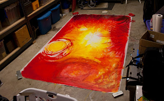
Here it is. It's 8'x5'. Again, click on images to enlarge.

You'll notice at one side it is really dark. (it's the bottom of the finished piece, looks like the top from this view) That is Golden's dioxane purple. It is very pigment heavy compared to the Liquitex paint I used years ago. Too intense for this piece. Fortunately, I had a happy accident while painting this in my garage, and spilled a little water on part of the canvas. When I blotted it up, it pulled a bunch of color as well. I then intentionally threw water on this part and got this result. I like how it adds depth. Reminds me of some of the background effects in Roger Dean's earlier work
On the lower right of the above image, you'll see this. It was originally a ton of golden metallic paint, that I then blotted up with a paper towel to give it texture. I then dry brushed it with red the next day, resulting in this. It reminds me of a Chinese color scheme and makes me think of the wonderful tradition of Red Envelopes. Because we used to live in Vancouver BC, it evoked memories of parts of that city and some friends I worked with there.
This part of the canvas is in the middle bottom of the above image (it's actually in the top center of the piece when it is hung up correctly). Following my method of mixing color on the canvas directly, I had a bit too much on this part of the canvas. I didn't want to risk the canvas buckling when it dried. So, I covered it with a paper towel, and this time jumped all over it with my shoes on. Then, worrying that the tread was trademarked, I brushed some of the texture away with the paper towel.
I was going to blend all of the colors in here like the rest of the price. But, when I started to do this, I saw this pattern emerge and had to keep it.
This section of painting took place at a Living Art party. Here is how the high frequency gravity lines were laid down. I had a volunteer model first put on a swimming cap, and then she chose a pose that integrated well with the existing background. She remained motionless for about an hour and a half! Everything else about the piece was typical of how I would work a piece. This was the first time I had an audience for this style. I've done body painting before, but this was more dramatic.
Arm Detail
When I photographed this, I was really impressed with the sculpted shape of these lines. I lowered the lights to accentuate the curves on these lines.
Reminds me of Eddie Van Halen's guitar pattern from the mid 80s. Why my pieces keep reminding me of rock related stuff is beyond me.
 |
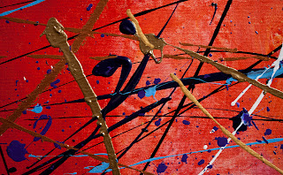
A lot of the detail shots look like they come from completely different pieces. I like the variation from part to part in my work.
I really like how the background blur on this image makes the blue line appear to float above the canvas. I'm considering making a piece, photographing it and then destroying it. Then only selling prints of the photo details. Maybe I'll never release the establishing shot, just let it remain a mystery.
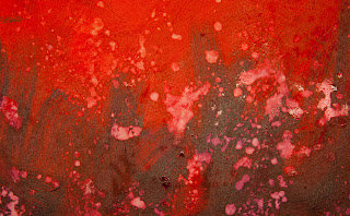
A smudge where the model got up. I really love how these colors mixed together. All such things are an integral part of the piece.
During photography of this piece, Max looked on with confusion as to why he couldn't walk on the painting.
Final piece. (edited) Now resides with a private collector. It was sold with proceeds going to charity.


