Tuesday, October 9, 2012

Gravity Painting #10, Final

Going to add more comments later, just wanted to get these shots up tonight.  Click to enlarge.


So, the interesting thing about this painting technique is that the piece looks different from different angles.  For a better understanding of how I did this, please read the previous two entries.  Entry 1  and Entry 2.

Long story short(er):  I made thick textures on the board with pumice gel and then sculpted it with a serrated clay tool, to make gouges and ridges in the gel.  I then painted the entire piece.  When it was dry, I then used an airbrush aimed not at the piece, but parallel to it!  The paint only landed on one side of each ridge, in the rainbow design seen above.  The detail shots below make this more apparent.

Ridges are easier to see, as the copper & golden paint filled the gouges a bit.

Reminds me of a butterfly wing close up.  Some dry brush work in black here.

Another detail of the ridges.

My daughter says that this part reminds her of crows flying in formation in the sky.

The three images above are from the same part of the piece, taken at different angles.  Worth clicking on for an enlarged view
Eye of Horus

Jupiter Cloud Pattern

No metaphor here.  Just a wonderful purple splat!

Second shot with a tennis ball; the first shots had more of a splat.

1980's comic book color scheme.  Or ketchup & mustard.

Enlarge for details of the teal & white swirls

All of these remind me of fantastic space imagery.

Classic colors and reflective pattern of amusement park ride paint schemes.


Finally, a cheesy animated gif, so you can see how the imagery changes depending on your angle.


Monday, September 3, 2012

Gravity #10 Work In Progress Part 2

Yesterday, I laid down the second coat on Gravity #10.  Except for one mistake, I only sprayed it from one direction.  This make is so that it looks different from different angles.  Confused?  Pictures are worth a thousand words.  Take a look below.


This is the angle in which I sprayed the paint.  I know where this painting is going to hang in the person's house who it is being made for.  When people exit the dining room & head into the living room, it will look like this (plus all of the splatter lines).  You can see part of Gravity Painting #9 in this shot, along with Lori Chandler-Lewis's "Pointy Garden"


This is the same painting from the other angle.  When they go from the living room into the dining room, this is what they'll see.


If the painting is looked at head on, this is what it will look like.  Mostly.  I had a huge challenge photographing this painting, because I only have two flood lights.  Normally when one photographs flat art, one can simply place the floods to either side of the image, and there is little or no glare.  Not so with this image.  Because the canvas has been altered by adding sculpted lines, any no diffuse lighting results in glare.  I ended up lighting it from a bunch of different angles & blending the angles together in Photoshop to get the most accurate image possible.


For those wondering what size this is, a little bit of background has been added for comparison.  Harry Potter (American & British) and other books in the background.

Gravity #8... Finally

Here ya go.  I wasn't as happy with this one as some of the other work I've done.  The smooth texture of the airbrushed background didn't integrate as well with the line art on the foreground.  Some may find this more pleasing.  Hey, the artist can't always be right :)   I think it was a worthy experiment, and it provided a lot of feedback for gravity #10.  Namely, the texture work I did when laying down the gesso was not dramatic enough to get the effect I was looking for.  Gravity Painting #9 proved to be more successful in that regard.


Wednesday, August 29, 2012

Gravity #10, Work In Progress

I have a very patient friend who is awaiting a commission piece that he won at a charity auction... back in June.  Right now I have the first part of the underpainting complete.  Now, I need to apply color from an angle, like I did in #9, so the color will change depending on the angle in which it is viewed.

Here's the process so far:
First, the panels were gessoed, with intentional texture

Then, the panel pieces were bound together

Turned out that gesso didn't have enough texture.  Added pumice based structural paint
Started work on underpainting
Head on underpainting complete.  Still needs angled painting

Tuesday, August 7, 2012

Gravity #9

New Painting!  Using a sculpted background and airbrush for a specific effect
(Gravity #8 still needs photos taken, in case you were wondering)


From this angle, it looks like a mostly red/black background

From this angle it looks mostly like a yellow background!

I love helping people think consciously about their own perceptions :)

Thursday, June 14, 2012

Gravity Painting #7... or #8??

So, I am doing a commission piece for a friend which is going to be a set of five panels.  So far, I've gotten the gesso on the panels.  So, does that count as #7?  Because tonight, I met a fellow named Will who needed his coveralls painted for the upcoming Fremont Parade. And, I started & finished it tonight.  Oh, nad they are coveralls, not exactly canvas (kinda, but not really...)  So do they even count at all??

The nice thing about this project is that I was able to test out some new paints.  I'm going to be painting a fair number of Naked Bicyclists who have a wonderful habit of showing up before the parade actually happens on Saturday.  I was able to figure out the best combination of paint, medium & water.
Here's the results:
White was too thin & dripped.  Fixed that for Sat.

Sunshine in his back pocket!


Sunday, May 13, 2012

Gravity Painting #6: A Study in Materials and Colors


This piece was an exercise in trying a new substrate, as well as mixing mediums. 

I chose a 12" Ampersand "GessoBord" for this piece.  I also wanted to try some earth tones.   Because this piece is only 12"x'12", I only laid down the background colors in paint, and used a Japanese calligraphy pen for the lines.

When I was getting ready to do a gloss medium wash over the piece, I found out that the ink was water soluble.  Yay!   A happy accident that worked in my favor.

Final piece after the medium dried.

Sunday, May 6, 2012

A Humbling Moment

Even though I thought I come up with the term "Gravity Painting" on my own, I decided to do a quick Google of the term.  The results were incredibly humbling.

First, there is a video of Amy Shackleton's process, here:  (Click for Video Link)

Not only is the process & result incredible, when you go to her website's gallery, it is obvious that she is prolific.

Go visit it now.  We'll wait for you.  Aim Artistry


Also, there is Holton Rower’s Paintings, which can be found here: Holton Rower


And, a video of the incredible process is here:  (Click here for YouTube link)

Feeling like I should go crawl into a dark, warm cozy place for a while now.  But, the great thing about the modern world, is that there is room for many artists, with many different styles.  It's great to see how others are using gravity and material science to create such work!

Friday, April 20, 2012

Gravity Painting #5: This One Deserves a Title


One of the reasons I made the previous paintings was to hone my understanding of how each type of paint would interact with specific supports to prepare myself to do this piece.  That isn't to say that they were 'just' tests.  They weren't.  If they were, I would have been a lot more methodical.  And, a lot more boring.  I am quite capable of doing experiment matrices with various compounds.  They were not that.  But, I knew I had this piece coming up.  And, I knew that if I wanted any chance of it succeeding on my terms, that I would need to understand what I was working with before I got to it.

The first gravity painting was done a long time ago, and has since been divided into its component pieces and sent to its new owners.  I had to reacquaint myself to these techniques.  I also had no idea how different brands of paint would behave.  I certainly didn't have time to formulate my own acrylics. One thing I did know was that when I did gravity painting 1.5 (which was a colossal failure and *may* eventually be shown here), was that unprimed tan canvas made a horrible support, and probably won't last as long as primed canvas.  The paint beaded up on it, and it just made me feel like I ate too many potato chips when I worked on it.  Bleech.

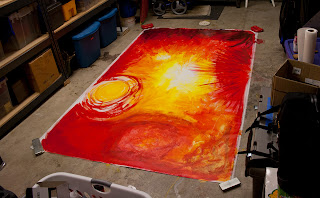
So, I needed a background color on primed canvas first.

Here it is.  It's 8'x5'. Again, click on images to enlarge.


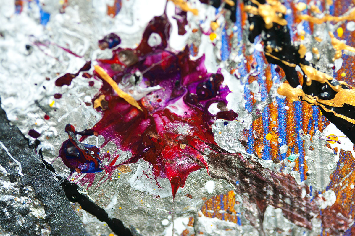
You'll notice at one side it is really dark.  (it's the bottom of the finished piece, looks like the top from this view)  That is Golden's dioxane purple.  It is very pigment heavy compared to the Liquitex paint I used years ago.  Too intense for this piece.  Fortunately, I had a happy accident while painting this in my garage, and spilled a little water on part of the canvas.  When I blotted it up, it pulled a bunch of color as well.  I then intentionally threw water on this part and got this result.  I like how it adds depth.  Reminds me of some of the background effects in Roger Dean's earlier work


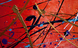
On the lower right of the above image, you'll see this.  It was originally a ton of golden metallic paint, that I then blotted up with a paper towel to give it texture.  I then dry brushed it with red the next day, resulting in this.  It reminds me of a Chinese color scheme and makes me think of the wonderful tradition of Red Envelopes.  Because we used to live in Vancouver BC, it evoked memories of parts of that city and some friends I worked with there.


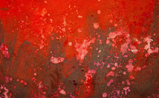
This part of the canvas is in the middle bottom of the above image (it's actually in the top center of the piece when it is hung up correctly).  Following my method of mixing color on the canvas directly, I had a bit too much on this part of the canvas.  I didn't want to risk the canvas buckling when it dried.  So, I covered it with a paper towel, and this time jumped all over it with my shoes on.  Then, worrying that the tread was trademarked, I brushed some of the texture away with the paper towel.


I was going to blend all of the colors in here like the rest of the price.  But, when I started to do this, I saw this pattern emerge and had to keep it.


This section of painting took place at a Living Art party.  Here is how the high frequency gravity lines were laid down.  I had a volunteer model first put on a swimming cap, and then she chose a pose that integrated well with the existing background.  She remained motionless for about an hour and a half!  Everything else about the piece was typical of how I would work a piece.  This was the first time I had an audience for this style.  I've done body painting before, but this was more dramatic.


Arm Detail


When I photographed this, I was really impressed with the sculpted shape of these lines.  I lowered the lights to accentuate the curves on these lines.


Reminds me of Eddie Van Halen's guitar pattern from the mid 80s.  Why my pieces keep reminding me of rock related stuff is beyond me.


A lot of the detail shots look like they come from completely different pieces.  I like the variation from part to part in my work.


I really like how the background blur on this image makes the blue line appear to float above the canvas.  I'm considering making a piece, photographing it and then destroying it. Then only selling prints of the photo details.  Maybe I'll never release the establishing shot, just let it remain a mystery.


A smudge where the model got up.  I really love how these colors mixed together.  All such things are an integral part of the piece.


During photography of this piece, Max looked on with confusion as to why he couldn't walk on the painting.


Final piece.  (edited) Now resides with a private collector.  It was sold with proceeds going to charity.


Finally, I added my signature: